New brand identity for the Mohren Brewery
News General news
Mohrenbräu Spezial now also available in the 0.33-liter returnable bottle
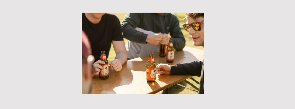
The Mohren Brewery is renewing its brand identity: the black silhouette in the logo will in future appear without the features that some consumers had considered racist. The old depiction of the head, which appeared on some products, is disappearing altogether. "Drinking beer should connect people. With our brand, we want to make a contribution to this," emphasized shareholder Irmgard Huber at a press briefing on Tuesday. As the first redesigned product, Mohrenbräu Spezial in the new 0.33-liter returnable bottle will be on the shelves starting next week.
A year and a half after an intense discussion about its logo, Mohrenbrauerei has presented the results of its branding process as part of the launch of Mohrenbräu Spezial in the 0.33-liter bottle. "Drinking beer is supposed to connect people. When people sit down together for a beer, understanding and respect for each other is created. With our brand, we want to make a contribution to this togetherness," said shareholder Irmgard Huber at Tuesday's press briefing at the company's headquarters in Dornbirn. She represented the managing director and partner Heinz Huber, who was ill. The Mohren Brewery had therefore decided to renew its brand identity.
The black silhouette of a head in the logo will be retained, but in the future it will be presented in a very neutral way. Pouty lips, snub nose and the somewhat bent neckline disappear from the representation. "It was important to us that those features that some people perceived as racist be revised," emphasized co-managing director Thomas Pachole.
The company is replacing the previous lettering with historical lettering. The year listed on the labels is now 1763, the year of the first documented mention under Johann Mohr. Previously, the year referred to the takeover by the Huber family, which still runs the Mohren Brewery today in the sixth generation.
Uniform design for all products
The new brand identity will be used uniformly on all products in the future. It thus also replaces the historical representation found on Kellerbier and some advertising materials. "This very old representation in particular offended some people. It shows the stereotype of a black person as used in colonialist depictions. It's not in line with our values," Pachole described.
The company is aware that "you can never please everyone," the two executives stressed during the presentation. "There will continue to be discussions. For some it's too much, for others not enough." In the course of the branding process, customers were consulted and many experts were involved. Pachole: "We decided to change our figurative mark, but leave the head in the logo. This expresses very clearly: We stand by our tradition, but distance ourselves very firmly from racism."
Classic in small format
The first product with the revised brand identity is Mohrenbräu Spezial in the new 0.33-liter light bottle, which was also presented on Tuesday. With a market share of 31 percent, the "Spezial" is Vorarlberg's best-selling beer by far. "With the small returnable light bottle, we want to appeal to new target groups who would like to enjoy Vorarlberg's most popular beer in smaller units," explained Managing Director Pachole.
The Mohren Brewery bottles the "Spezial 0.33" in the resource-saving returnable lightweight glass bottle. It was introduced in 2019 and has been extremely well received by consumers. The new product will be available in stores from mid-March. Mohren Brewery sells 97 percent of its beverages in returnable containers.
Long-term process
As early as next week, Spezial in the traditional 0.5-liter returnable bottle, Pfiff and Helles will also go on sale in the new design. The conversion of all products is then expected to be completed by the end of 2022. An area dedicated to the history of the brewery and the development of the brand will also be set up in the Mohren Brewery Museum.
At the same time, the brewery is starting the successive replacement of glasses, beer mats, and promotional materials in the catering trade, as well as the production of new crates and truck tarpaulins. For cost and environmental reasons, materials are replaced whenever they actually need to be renewed. This applies to the hundreds of thousands of beer crates, for example. According to the Mohren Brewery, the costs for the complete changeover of the brand identity are in the millions.
Living responsibility in the region
For the company, the branding process went well beyond the redesign of the logo, emphasized shareholder Irmgard Huber at the press briefing: "We have once again become more aware of what we stand for: Mohrenbräu is THE Vorarlberg beer. This process will have a clear impact in the company in all areas."
Huber sees regionality, quality, innovation, and tradition as the company's most important values: "We take responsibility for our beautiful state, for the people who live and work here. We see ourselves as a partner of Vorarlberg trade, tourism and gastronomy."
An expression of this are the diverse sponsorships with cultural and sports clubs and with social projects. The company consciously works with regional suppliers wherever possible, continuously invests in environmental protection and sustainable production. After launching its own lager beer under the name "Helles" last year, the brewery announced further product innovations for this year.

