FRUCADE with a fresh design
News General news
FRUCADE - The local lemonade starts the summer season with a modernized brand identity.
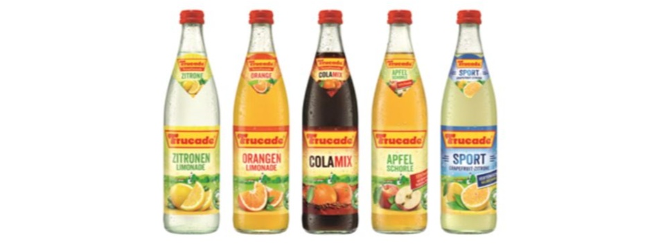
More modern and fresher, without denying the traditional character of the brand invented in 1952: this is how FRUCADE's redesigned labels present themselves. The aim of the revised packaging design is to showcase the high product quality of the lemonades in a contemporary way.

FRUCADE is known as the "Heimatlimonade" (regional lemonade). It is produced regionally in southern Germany by around 50 small and medium-sized breweries or mineral springs and transported to customers over short distances. With the new design, the "Heimat" has been interpreted in a contemporary and modern way. Realistic fruit illustrations reflect the FRUCADE values of "natural fruitiness" and "freshness". In the future, "Heimatlimonade" will also be found in the logo of the FRUCADE lemonade range. Variety fonts, disruptor shape and color have been redesigned, as has the green seal "The best from our homeland". At the same time, the landscape motif and the familiar FRUCADE logo ensure a high level of recognition.
"We took a sensitive approach to the makeover in order to further strengthen the appeal of our successful local-hero brand FRUCADE," says Volkmar Goebel, marketing manager at FRUCADE licensor DrinkStar. "In doing so, we remain true to our brand values. FRUCADE stands for home, fruitiness, tradition and originality. The design visualizes this quality promise adapted to the new zeitgeist."
The new label look will be implemented successively on the part of FRUCADE license partners. To support brand awareness and sales, radio spots can be heard on wide-ranging radio stations in southern Germany.


