Fresh look - eye-catcher at the POS
News General news
After more than five years, Gerolsteiner is subjecting its entire mineral water range (sparkling, medium, natural, fine sparkling) to a comprehensive label relaunch. "Market research has shown that the previous label design is still very popular with consumers, but we believe it is essential to continuously develop the brand design and keep it up to date. It is important for us to involve our customers in this further development," emphasises Marcus Macioszek, Head of Marketing at Gerolsteiner Brunnen. The new design will gradually find its way into stores from 2024.
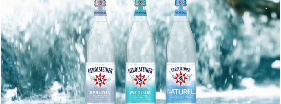
It will start with the volume containers, followed by the other household containers and, in the second half of the year, the mineral water containers for the catering trade. The redesign in co-operation with the Justblue Design agency from Hamburg was accompanied by several market researches. In the opinion of those surveyed, the final label design is more modern, shows a clear brand profile, ensures independence at the POS, presents water in an attractive way and is perceived by consumers as invigorating, refreshing and natural.
Better long-distance effect, quick variety differentiation
The red Gerolsteiner star with the lion crest is larger and - thanks to the change from a three-dimensional to a two-dimensional representation - more striking: The result is an improved long-distance effect. The new design gives the image of the spring on the label a certain depth and more emotionality. This impression is supported by a glowing effect emanating from the Gerolsteiner star. The updated logo can also be seen in the new TV advert for Gerolsteiner mineral water (claim: "Gerolsteiner - Bring back the power!"), which was launched in mid-September by the David+Martin Berlin agency. To help consumers quickly find their way around when choosing the mineral water variety they want, the colour of the variety can now be seen in a larger format on the label. The variety names are shown in capital letters.
USP is communicated on the label
The message "From the depths of the Volcanic Eifel" below the variety lettering puts the USP of Gerolsteiner mineral water centre stage. The most important ingredients are now particularly emphasised on the back of the label. The naturally high mineralisation - calcium, magnesium and hydrogen carbonate are typical of Gerolsteiner - is an important unique selling point that the mineral water owes to its origin in the Volcanic Eifel. The new label is also used to present the mineral spring's commitment to sustainability using the Gerolsteiner Future Forest project as an example: Healthy forests are an essential prerequisite for healthy water. This is why Gerolsteiner has been campaigning for climate-stable forests in the Eifel region since 2013. A QR code links to the sustainability pages on the website www.gerolsteiner.de, where a deeper insight into Gerolsteiner's activities is provided.

