Herforder gets a new look
News General news
Revised packaging design goes on sale / Ramp start for Herforder Maibock was on January 25

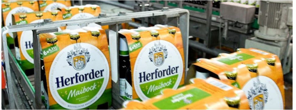
Fresh, authentic and with clear differentiation of varieties on the shelf: the Herforder Brauerei is investing further in its brand and following up its advertising campaign launched in August with new packaging. In addition to all the bottle labels in the Herford range, the six-packs and the eight-pack carrier are also getting a contemporary design. At the end of January, the classic Herforder Pils and, with the start of the ramp on January 25, the seasonal specialty Herforder Maibock were launched in the new look in the beverage markets. It was developed by the Flächenbrand agency from Hamburg.
For more than 140 years, Herforder has stood for the art of Westphalian brewing. "The importance of Herforder in the region is great. In the core market of East Westphalia-Lippe and the Osnabrück region, the brand is associated with 'home' by many users," says Christian Gieselmann, a native of Herford and spokesman for the management of the Warsteiner Group, to which the Herforder Brewery belongs. The quality of the beers is recognized. In contrast, there was a need to catch up in terms of product features. "Herforder is a high-quality regional brand and this should also be reflected in a high-quality appearance. The new visual identity carries the brand's design into the here and now and underscores the high quality of the beer."
The new design remains true to the original brand DNA. Essential elements such as the blue Herford lettering, the coat of arms, the founding year "since 1878" and the reference "Westphalian art of brewing", have been retained but visually restaged. The abandonment of ornamental embellishments culminates in the reduction of the coat of arms, in which a change from red to orange now establishes the connection to the color of the Herford crate. "The new look appears tidy and self-confident," describes Peter Lohmeyer, Head of Marketing and PR Herforder Brauerei. "This is an important step in further strengthening identification with the Herforder brand and appealing to new users."
In the future, it will be made even easier for them to access the Herforder product range. Both on the bottle label and on the neck loop, the variety designation stands out clearly in distinctive lettering on a colored background. The second element used throughout is the concise description of the flavor, which shows users at a glance which Herford specialty matches their own preferences. The model for this was the label for Herforder Landbier, which until now has been clearly distinguishable from the other varieties. Now, the naturally cloudy specialty is being brought closer to the umbrella brand by adapting the label shape, among other things. Its rustic character will continue to be underlined by beige and brown tones and the addition of the words "Vollmundig süffig" ("Full-bodied and drinkable").
The new design of the six-packs and the eight-pack carries on the revised label look and allows the primary and secondary packaging to form a single visual unit. And the link is also successful across all containers. Peter Lohmeyer: "In keeping with the Herforder crate and the eight-pack carrier, the basic color orange now also dominates the six-pack. Herforder remains true to its origins!"
And this design of course fits perfectly with the new campaign, which was presented last August: "Willste auch eins?" (Do you want one, too?) should finally become a rhetorical question.


